Saturday, October 31, 2020

Ideas from the blue


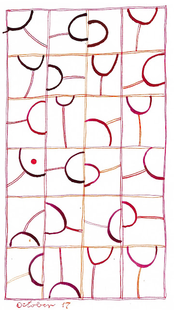
A long time ago I made a little doodle on the side of a larger piece of paper.  I think I was trying a large round pen nib to see what kind of line it would make, and drew the U-shaped curve.  Then at some later point I think I had another pen in hand, sketched the surrounding box and made a "stem" for the "wineglass."  The piece of paper nestled in with my piles of clippings, and I kept running across it every now and then.

Earlier this month I decided the little doodle was striking some kind of chord with me, because every time I came across it, I carefully put it back onto a pile instead of into the wastebasket.  So I did my daily calligraphy based on the doodle.  


And then I did it again, and again and again.  The "wineglass" changed shapes and orientations and colors, and occasionally morphed into a dumbbell with two curves in the box instead of one. The boxes escaped from the grid to stand alone. The pale washes that I had been using in other calligraphy appeared.  


It's hard for me to articulate why this little doodle makes me so happy.  And it's turning out to be hard to use it in a satisfying way on the large page of a sketchbook instead of the tiny one-off version that I've kept so long.


I don't know if I'm done with this motif or not.  I'm not even sure I like this series of experiments.  Are they losing their spontaneity as I do them over and over?

I've done this in the past, made something that seemed great the first time around but never as good again, no matter now many times I revisit it.  Maybe that's because I love to work improvisationally, without the safety net of sketching or a lot of planning ahead.  So when I come back and do the same motif again, it seems constrained and artificial rather than serendipitous.  What do you think?  Have you had a similar experience?


Tuesday, October 27, 2020

Ideas from others -- Marina Soria

This summer I got an email from Jan Milne, who reads my blog from Australia and wondered if I was familiar with the work of Marina Soria, a calligrapher from Argentina.  I wasn't, and immediately looked her up.  Among all the images I saw, one sent me straight to my sketchbook to emulate.

Marina Soria


Two ideas to play with: first, trapping the letters between horizontal lines, and second, filling in some of the negative spaces with pale washes of color.  Here's my version:


I worked with this idea for a while, then decided it would be interesting to use the wash-in-negative-space approach with other styles of lettering.  Here's what I came up with then:


I like to use washes -- about the only thing I can do with a brush that seems to look good (clearly need more practice....).  I've had fun with this technique (you can see all my daily calligraphy here on my Daily Art blog) and want to give many thanks to Jan for tipping me off to this new artist.  Almost every time you look at somebody else's work in the same ballpark as your own, you find ideas to test out and riff on.  Do they become a permanent part of your repertoire or just an experiment?  Only time will tell.


Sunday, October 25, 2020

Finished at last

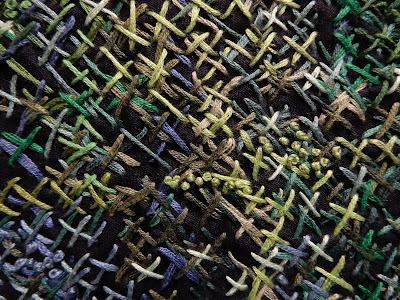
It's been years since I started working on a series of cross-stitched pieces that were largely worked from the  back side of the fabric.  I like this technique because you can't exactly see what you're doing, thus leaving yourself open for surprise and serendipity.  I have been almost done with three of these pieces for months and months, but kept them at hand to work on while watching TV.  They kept getting more and more densely covered with cross-stitches and french knots, but there was always room for some more.


But finally I needed to finish them for a show.  One of my fellow artists in PYRO Gallery invited the rest of us members to have work in his show, titled "Organic Forms."  As I thought about my supply of finished work, there was very little that would fit that description, except the three cross-stitched pieces that definitely looked like gardens.  

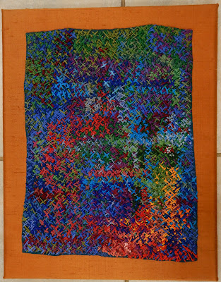
After considering fifteen different ways of potentially mounting or displaying the pieces, I finally decided to mount them on stretched canvases, covered with silk.  The smallest piece fit nicely on a larger canvas with complementary color as a surround.


Kathleen Loomis, Blue Garden


But the two larger pieces were bigger, and I didn't want the finished presentations to be huge.  So I used 12x24" canvases available at the craft store (at 50% off) and decided to just let them overhang.  You know, the way foliage and flowers often escape from their appointed places to sneak into the rest of the landscape.

Kathleen Loomis, Night Garden Blue


Kathleen Loomis, Night Blooming Cereus


The show will be up at PYRO Gallery, 1006 E. Washington St in Louisville, through the end of November.  Opening hours are limited but we're always willing to meet visitors by appointment and we'd love to show you all the art.


Wednesday, October 21, 2020

A message from Alison 2

I wrote earlier this week about exchanging messages with Alison Schwabe, a longtime internal pal who lives in Uruguay and commented about my Memorial Day quilt that consists of 4000+ tiny American flags.

And once she got on the subject of flags, Alison wrote some other things worth sharing.

"Lately with all the USA election commentary on our cable channels here, CNN and BBCWorld, the stars and stripes of your flag have been the core of all the graphics, obviously, and I'm no stranger to US elections coverage, but this season it's been striking to me that any combination, any arrangement, of star+stripe+red+blue+white is a visual shorthand for a statement of your country.  I don't mean depictions of the flag itself, everyone has things from tea towels to clothing patches, coffee mugs etc etc with our national flag on.  I mean the elements which combine to make up the flag design.  You see it in fabrics and clothing, sunglasses, household objects, all kinds of things in addition to the bunting and stuff that's rolled out for electioneering events at all levels.  Even the round carpet in wherever it was Biden was speaking from last Wednesday night was red and blue with central white star!  I'm not aware that any other country's national flag has spread out so much from its actual flag format."

I am a flag junkie and have used flags a lot in my art, as well as taking photos of them any time I can.  So Alison's comments made me think about the ubiquity of the flag's elements.  Even the nicknames of our flag -- The Stars and Stripes, The Red, White and Blue -- demonstrate by metonymy and synecdoche how the elements instantly conjure not only the whole flag but the nation itself, a linguistic shorthand as well as a visual one.

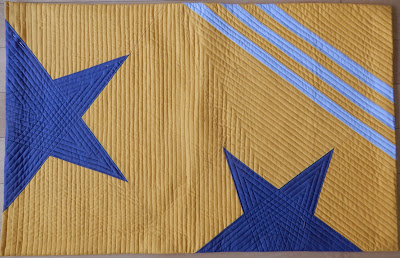
I've begun a series of quilts called "Stars and Stripes" in which I'm exploring how you can use those two shapes and how much you have to change them around before it no longer reads as a flag.

I'm planning to make six quilts in the series.  Here's number one, obviously a flag:


Number two, a little less flag-like, but still pretty obvious:

I think this next one is going to be number four, and if you don't see it hanging from a flagpole, you probably wouldn't read this as a flag, thanks to unflaglike grays:

Alison mentions the use of flag elements in household stuff.  She's right -- add the colors to some sort of star and stripe, and you're totally "patriotic," as witness this stuff I found in a Walmart some years ago near Fourth of July, never mind that it was all made in China.