Thursday, June 20, 2019
Calligraphy update -- brut style
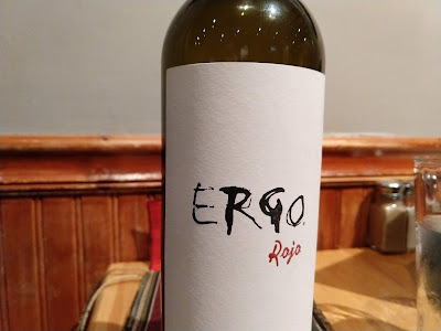
The other night I was intrigued by the label on our wine bottle, what you might describe as calligraphy brut.
Always searching for new ideas for my daily calligraphy, I took this one home and tried it out a few times.
I like it! Legible, but not beautiful. (Legibility is not a requirement for successful calligraphy, in my opinion, but it's OK in its place.)
I keep searching for a calligraphic style that would let me use letters in a more abstract way, more like art and less like writing. Maybe this is a first step in that direction, but I'll have to work on it. Different sizes of letters? Overlapping letters? Letters going in different orientations? Script? Less legibility, more brutalism?
I'll try again this evening.
Subscribe to:
Post Comments (Atom)


No comments:
Post a Comment