Saturday, October 31, 2020

Ideas from the blue


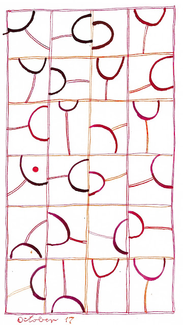
A long time ago I made a little doodle on the side of a larger piece of paper.  I think I was trying a large round pen nib to see what kind of line it would make, and drew the U-shaped curve.  Then at some later point I think I had another pen in hand, sketched the surrounding box and made a "stem" for the "wineglass."  The piece of paper nestled in with my piles of clippings, and I kept running across it every now and then.

Earlier this month I decided the little doodle was striking some kind of chord with me, because every time I came across it, I carefully put it back onto a pile instead of into the wastebasket.  So I did my daily calligraphy based on the doodle.  


And then I did it again, and again and again.  The "wineglass" changed shapes and orientations and colors, and occasionally morphed into a dumbbell with two curves in the box instead of one. The boxes escaped from the grid to stand alone. The pale washes that I had been using in other calligraphy appeared.  


It's hard for me to articulate why this little doodle makes me so happy.  And it's turning out to be hard to use it in a satisfying way on the large page of a sketchbook instead of the tiny one-off version that I've kept so long.


I don't know if I'm done with this motif or not.  I'm not even sure I like this series of experiments.  Are they losing their spontaneity as I do them over and over?

I've done this in the past, made something that seemed great the first time around but never as good again, no matter now many times I revisit it.  Maybe that's because I love to work improvisationally, without the safety net of sketching or a lot of planning ahead.  So when I come back and do the same motif again, it seems constrained and artificial rather than serendipitous.  What do you think?  Have you had a similar experience?


Tuesday, October 27, 2020

Ideas from others -- Marina Soria

This summer I got an email from Jan Milne, who reads my blog from Australia and wondered if I was familiar with the work of Marina Soria, a calligrapher from Argentina.  I wasn't, and immediately looked her up.  Among all the images I saw, one sent me straight to my sketchbook to emulate.

Marina Soria


Two ideas to play with: first, trapping the letters between horizontal lines, and second, filling in some of the negative spaces with pale washes of color.  Here's my version:


I worked with this idea for a while, then decided it would be interesting to use the wash-in-negative-space approach with other styles of lettering.  Here's what I came up with then:


I like to use washes -- about the only thing I can do with a brush that seems to look good (clearly need more practice....).  I've had fun with this technique (you can see all my daily calligraphy here on my Daily Art blog) and want to give many thanks to Jan for tipping me off to this new artist.  Almost every time you look at somebody else's work in the same ballpark as your own, you find ideas to test out and riff on.  Do they become a permanent part of your repertoire or just an experiment?  Only time will tell.


Sunday, October 25, 2020

Finished at last

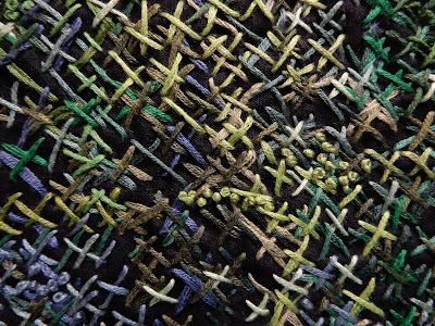
It's been years since I started working on a series of cross-stitched pieces that were largely worked from the  back side of the fabric.  I like this technique because you can't exactly see what you're doing, thus leaving yourself open for surprise and serendipity.  I have been almost done with three of these pieces for months and months, but kept them at hand to work on while watching TV.  They kept getting more and more densely covered with cross-stitches and french knots, but there was always room for some more.


But finally I needed to finish them for a show.  One of my fellow artists in PYRO Gallery invited the rest of us members to have work in his show, titled "Organic Forms."  As I thought about my supply of finished work, there was very little that would fit that description, except the three cross-stitched pieces that definitely looked like gardens.  

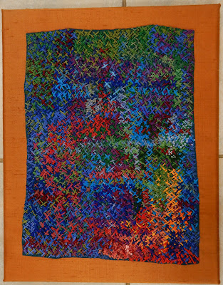
After considering fifteen different ways of potentially mounting or displaying the pieces, I finally decided to mount them on stretched canvases, covered with silk.  The smallest piece fit nicely on a larger canvas with complementary color as a surround.


Kathleen Loomis, Blue Garden


But the two larger pieces were bigger, and I didn't want the finished presentations to be huge.  So I used 12x24" canvases available at the craft store (at 50% off) and decided to just let them overhang.  You know, the way foliage and flowers often escape from their appointed places to sneak into the rest of the landscape.

Kathleen Loomis, Night Garden Blue


Kathleen Loomis, Night Blooming Cereus


The show will be up at PYRO Gallery, 1006 E. Washington St in Louisville, through the end of November.  Opening hours are limited but we're always willing to meet visitors by appointment and we'd love to show you all the art.


Wednesday, October 21, 2020

A message from Alison 2

I wrote earlier this week about exchanging messages with Alison Schwabe, a longtime internal pal who lives in Uruguay and commented about my Memorial Day quilt that consists of 4000+ tiny American flags.

And once she got on the subject of flags, Alison wrote some other things worth sharing.

"Lately with all the USA election commentary on our cable channels here, CNN and BBCWorld, the stars and stripes of your flag have been the core of all the graphics, obviously, and I'm no stranger to US elections coverage, but this season it's been striking to me that any combination, any arrangement, of star+stripe+red+blue+white is a visual shorthand for a statement of your country.  I don't mean depictions of the flag itself, everyone has things from tea towels to clothing patches, coffee mugs etc etc with our national flag on.  I mean the elements which combine to make up the flag design.  You see it in fabrics and clothing, sunglasses, household objects, all kinds of things in addition to the bunting and stuff that's rolled out for electioneering events at all levels.  Even the round carpet in wherever it was Biden was speaking from last Wednesday night was red and blue with central white star!  I'm not aware that any other country's national flag has spread out so much from its actual flag format."

I am a flag junkie and have used flags a lot in my art, as well as taking photos of them any time I can.  So Alison's comments made me think about the ubiquity of the flag's elements.  Even the nicknames of our flag -- The Stars and Stripes, The Red, White and Blue -- demonstrate by metonymy and synecdoche how the elements instantly conjure not only the whole flag but the nation itself, a linguistic shorthand as well as a visual one.

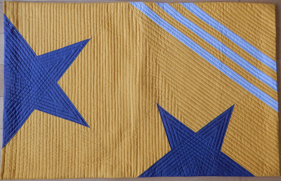
I've begun a series of quilts called "Stars and Stripes" in which I'm exploring how you can use those two shapes and how much you have to change them around before it no longer reads as a flag.

I'm planning to make six quilts in the series.  Here's number one, obviously a flag:


Number two, a little less flag-like, but still pretty obvious:

I think this next one is going to be number four, and if you don't see it hanging from a flagpole, you probably wouldn't read this as a flag, thanks to unflaglike grays:

Alison mentions the use of flag elements in household stuff.  She's right -- add the colors to some sort of star and stripe, and you're totally "patriotic," as witness this stuff I found in a Walmart some years ago near Fourth of July, never mind that it was all made in China. 


Sunday, October 18, 2020

A message from Alison 1

Recently I struck up an email conversation with Alison Schwabe, an internet pal who lives in Uruguay, whose blog I read.  She announced that she got into Quilt National 21 and lamented the fact that this time around she probably won't be able to go to the opening festivities next spring, as she had for all the previous QNs she was in.  I sent her congratulations and mentioned that I couldn't remember which of those celebrations she and I both attended -- the only time we have met in person, to the best of my recollection.

Alison wrote back and said "I think we might have both been at QN09 where your wonderful piece Memorial Day was hung so impressively there in prime position near the entry! ...I imagine it is in a collection now?"

Funny she should mention it, because just this month Memorial Day went off to its permanent home, at the International Quilt Museum at the University of Nebraska in Lincoln.  IQM is attempting to acquire as many as possible of the big prizewinners from all previous Quilt National shows, thanks to a grant from the Robert and Ardis James Foundation, and my quilt qualified because it won the Quilts Japan Prize at QN09.

It was a bittersweet task to pack up Memorial Day and send it away forever.  Yes, it will be seen by many, many more people, and be taken care of in much more archival fashion than it has been for the last nine years, packed in a box under my guest room bed.  But mothers always worry a bit when their babies grow up and leave home.

Here's a peek of it, still beautifully wrapped in a sheet as it came home from the QN national tour, and as it went away to Nebraska.  (Because the quilt consists of 4,083 tiny bits, hanging by threads, it's extremely difficult to fold it properly.  When I sent it off to QN I had three friends and a very large table to help me.  The QN people did a much better job repacking it than we had in the first place and I wasn't about to undo it at any point during the last decade lest I never get it properly folded again.)

Alison said she looked up Memorial Day in her QN catalog, "and remember being amazed that each of those tiny patches is a suggestion of a US flag, of red/white striped fabric with a tiny little piece of navy fabric in the top LH corner of each.  You had several different red/white striped fabrics, and I think each piece was double sided?  I didn't remember that the final row was incomplete... and I can't even wrap my mind about how you made that!"

She's right, each of the thousands of flags is a little quilt, made with red/white stripes on the front, plain green denim on the back, and a lot of stitching.  I had found a bunch of different R/W striped fabrics, and a bunch of different navy fabrics with little white stars or dots or random speck patterns to simulate the union of the flag.  And I had also bought a yard of an old Nancy Crow fabric with actual tiny flags to accurate scale (and made my homemade flags in the same size).  

The final column of the quilt was incomplete because the quilt marks the number of US troops who died in Iraq.  The count starts at our invasion in March 2003 and ends on Memorial Day 2008 -- 4,083.  All the columns had 70 flags except the last one, with only 23.

How I made that -- yes, it's hard to imagine the process.  It took me several "postage stamp" quilts to work out a process, and if you're interested, here's how I do it.  But after you've figured that out, it's just a case of sewing, sewing, sewing, sewing.  As I was trying to finish this quilt in the summer of 2008, I realized one day that my right knee was extremely unhappy.  Who knew that the sewing machine foot pedal was enough work to cause repetitive stress injury?  I finished the quilt with my left foot on the pedal (surprisingly difficult) and the knee rested up to normal, so a happy ending.

Thanks, Alison, for prompting my walk down memory lane -- and congratulations on your QN triumph!   


Friday, October 16, 2020

Last month on Art With a Needle -- Designer DIY

It's been a while since I caught up with the comments that you all have left on the blog.  

I've gotten many comments on my snarky remarks about the Designer DIY series in the New York Times, which has appeared on and off on Thursdays since springtime.  It disappeared for a few months in late summer, reappeared for two weeks this month, and then was AWOL this past week -- I hope for good. 

Shannon spoke for many of my readers when she said "the horribleness of these makes me think surely they are tongue-in-cheek, yet they seem so self-serious..."  Marilyn wrote: "I'm on a news fast this weekend, the news is so miserable, and this is a perfect antidote.  Funny!  Do you think anyone really makes these things?"

Several people snarked at the "ironic Amish" designer who would have us cut up pillowcases to make dresses.  Shasta wrote: "This is a good way to make clothes when you are under 9 and haven't figured out how to use the sewing machine yet.  I am still trying to figure out 'itonic.'  My nephew took my old TV for his dorm room because he said it was ironic."  LES wrote: "My parents were Amish as children, and I can tell you, that ain't Amish, ironic or not.  Pillowcase dresses are for 3-5 yr olds, not grown women.  Once again, thanks for the laughs!"

Rena wrote: "Thoroughly enjoyed your critique.  First gut-busting laugh this year.  Would be fun to see photos from NYT readers modeling their pillowcase creations..."

And yet... I got an email from my friend Susan who said, "But the truth is, when I was in my teens, and much scrawnier than now, I did make a few sleeveless summer dresses out of (not very worn) king sized pillow cases.  I opened up the seams at the top center and top of each side, and then used the seam allowances as facings for the boat neck and armholes... and they came pre-hemmed.  Thanks for the memories!"

Several readers have commented over the months of the Designer DIY feature that I could do the job better than the editor/writer.  I will modestly point out that it's much easier to make fun of the finished product than it no doubt was to wrangle articles out of prima donna designers who clearly have no idea of how to actually make something.  But thank you for your kind thoughts!  Norma wrote: "Kathy, I love reading your critiques of these articles.  Can there really be an editor that approves of these?"  Bea wrote:  "You might compile these blogs in a book and send to the Times?"

Bea, I'm way ahead of you.  During the summer I wrote a long message to Vanessa Friedman, the fashion editor of the Times, pointing out how lame this series has been.  I sent links to all the blog posts I had done to date and begged her to pull the plug on the series.  "If your purpose in this series is to win brownie points in the fashion community and give some designers a bit of free ink, then you have probably succeeded, especially among readers who don't actually try to do the projects.  But if your purpose is to give your readers projects they can succeed at and feel proud of, your are failing miserable," I wrote.  "I apologize for the snarky tone of these posts, but Ms. Friedman, you have certainly asked for it.  Properly executed, this could be a wonderful series.  But instead it's a laughingstock among people who know sewing, embroidery and crafts.  And probably it's a great disappointment among people who don't, and looked to you for guidance that didn't work." 

I suggested that she let people who know how to do handwork write the instructions, or "better yet, let somebody who does actual handwork come up with the ideas too, so you could present projects that are doable and attractive."

I received no response, of course.  I have spent a little time thinking about what kinds of projects I could dream up for housebound readers with little or no experience in sewing or working with fabric if indeed I were running this project.  Easier said than done, especially when you realize that most people out there, unlike you and me, don't possess fabric, needles, thread, embroidery hoops, pins, sewing machines or any of the huge array of stuff that makes our projects possible.  Nor can a lot of them sashay down to the local fabric store and stock up. 

So what projects would you recommend if you were in charge?


Friday, October 9, 2020

Designer DIY -- almost great!

I've gotten so used to mocking the Designer DIY feature in the New York Times that it's a big surprise to find one with not only a good idea but pretty good execution.  In fact, some useful hints that might help you in many other contexts of your art life.  This week's designer is Dries Van Noten, who only inches away from the DIY feature had a shout-out for this strange outfit, but we won't hold that against him.

Photo and drawings -- New York Times


Today you're going to take a cotton T shirt and paint it with flowers.  In contrast to the skimpy directions usually found in this series, you're given extensive guidance on how to tape paper onto your work table


and how to put cardboard between the layers of the shirt so the paint doesn't bleed to the back.


The part that I like is the hints on how to paint the flowers.  You should draw three circles on the shirt, and for the artistically challenged, he suggests where to put them.


Yes, the drawing has right and left confused, but never mind.  Here comes the good part.

"Starting at the end of the line closest to the circle, paint a curved line in a fluid motion toward the other end of the line to create one side of the flower petal.  Repeat this step on the other side of the line.  The flower petal outline should resemble an elongated raindrop."  After you have turned all the straight lines into petals, "use the long edge of the sponge brush (dipped in paint) to place straight lines sporadically around the flowers to illustrate the stalk, pistil and stamen of the flower."

Then you draw some leaves "around and between the flowers to the three separate flowers connect into one fluid design.  The leaves can extend onto the top shoulder and upper arm of the shirt."

The illustrations, as always in the Designer DIY series, don't help much, but they do seem to tell you to use a brush when painting the flowers.


I like this advice on how to arrange and paint flowers.   (Previous designers in this series would have kissed this off by saying "now paint beautiful flowers all over your shirt!")  I've drawn a bazillion flowers in my life, and this advice about first sketching the straight midline of each petal and only then putting the curved edges around it would have greatly improved most of them. 

But I have one serious complaint about this feature: what it says about the paint.  It calls for "dispersion paint, in any contrast color."  What is dispersion paint, you might ask, as I did.  I googled and discovered that it's water plus solid particles of pigment.  But the google page is ominous, including such phrases as "stabilization of a pigment dispersion requires time and energy" and "paint physical properties (rheology, stability flocculations...) etc." and "the pigment agglomerates are broken up by flocculation/deflocculation" and linking to websites like coatings.specialchem.com.  

I somehow suspect the average NYTimes reader who hasn't had any experience painting on fabric might wonder what this means, and more to the point, wonder if anything already lurking around the house would work or if they need to buy something.  And if so, what they should buy.

Unlike every other consumer product that I have ever googled, when I type in "dispersion paint," the top of the results page does NOT show me five products available from amazon.  Which leads me to suspect that "dispersion paint" is a phrase the designer ran into once in art school but has never had the occasion to actually purchase or use. 

If I were editing this feature, I would have cut back on the third drawing of a paint brush amid a sea of flowers and said something like: "Use fabric paint if you have it; it can be heat-set and then washed, and will leave your shirt soft and drapable.  If not, use regular acrylic paint sold for crafts or kids' art projects; your shirt will be a little stiffer and will probably do better with hand-washing.  In a pinch, use house paint, but understand that your shirt will be a lot stiffer and more susceptible to cracking.  Don't use tempera paint or anything described as washable."  But then, I'm not writing these features.

As always, the watercolor of the finished project looks beautiful.  This time I think some of the actual projects will look pretty good too. 


Thursday, October 1, 2020

Designer DIY -- for your vacation

Today's Designer D.I.Y. in the New York Times tells us how to make "A Vacation Accessory With a French Attitude."  I'm not planning any vacations in the near future, but maybe you are, so faites attention!  This week we're going to make a handbag from a square of fabric, as directed by Roland Mouret, apparently famous for this dress, this year's model of which you can get for $2650.  


Mouret used denim cut-offs for his 20-inch square of fabric but if you aren't willing to repurpose your pants, "a thick cotton-like denim works particularly well." (I wonder what cotton-like denim is really made of.)  No mention of how to cut the square if you are indeed using your pants, because where the seam falls will have some effect on the ease of construction.  But you'll certainly figure it out after your first square doesn't work.

A hallmark of the NYTimes series has always been confusing directions, and this installment does not disappoint.  Follow along, if you can:  "Lay your fabric square flat.  Taking two diagonally opposite corners, fold toward the middle with a significant overlap until a point is created at one of the remaining corners.  The fabric will now be in the shape of a kite.  Knot the corner of the fabric where the point has been created."

Illustrations from New York Times Thursday Styles

If you're a bit lost, consult the diagram.  Hmmm.  What do you see in the diagram?  If you're "taking two opposite corners," why are the two hands holding adjacent corners?  Which of the remaining corners is making the point?  Are you making a point from the corner in the left hand or the right hand?  Where is the kite shape?  Why are you folding the fabric in the first place?  If you want a point in one corner, why not just grab it and let the rest of the fabric hang?  
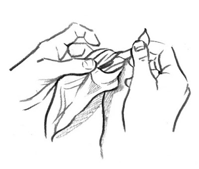
The next diagram shows you how to tie a knot.  Or gives an approximate impression of tying a knot, because it's not very clear what is what in this drawing.  But it's pretty.

Moving right along, now you repeat to make a point and knot in the opposite corner from the first one.  "This will be slightly more difficult now that the other corner is already knotted," the Times says, presumably because the knot somehow interferes with the unnecessary folding into an unnecessary kite shape.

Almost finished.  Now you take the two other corners and knot them together, if you can figure out how to make points without kite-shaped folding first.  (If you've forgotten how to tie a knot, here's another diagram.) 


"An optional step here is to place a foam or cardboard rectangle at the bottom of the bag to create a flat base.  If you wish, you can glue the base into place."  Hold on. Good luck on getting a piece of cardboard with glue on one side into the already knotted bag.  If you want a base, you really should have done it well before "here," shouldn't you?  Like before the first knot?  No hint on how big to cut the rectangle or how to place it on the big square, but here's where you get to be creative. 

Finally, you need a "heavy link chain or several long necklaces" for a handle.  Thread it or them through the knots at the two ends.  No guidance on how to do this, although "using a chain with a jewelry clasp is easiest as it will allow you to thread through the knots before closing the chain."  The only illustration of the finished bag, however, shows no clasp, just a single length of chain.  No hint on how to keep the ends of the chain from coming out of the knots.  No hint on what to do if you used "several long necklaces."  Be creative again.

You're done!  Mouret says the bag would go well "with wide leg trousers and a one-shoulder silk top for an al fresco drink with friends."