I am of two minds when it comes to asking other people for advice, especially in large groups (whether in person or virtual). There are people whose advice you respect, and there are those who just volunteer useless praise or counterproductive suggestions. It's easy to ignore those in the second group, but what happens when those in the first group don't agree?
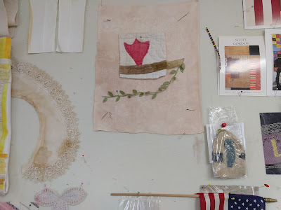
I have had a compositional fragment on my design wall for more than a year, a tulip on a branch cut out from a very old and distressed quilt, sitting on a torn piece from a linen napkin or tablecloth for background. At some point a length of leafy vine joined it, but I couldn't figure out what else needed to be there.Last week I found a piece of embroidered silk that seemed to want to join the party, so I stitched it to the bottom corner of the linen. The original embroidered stems and leaves had begun to disintegrate, so it took a fair amount of stitching with almost-matching thread to secure the fabric and restore the design.
Next I extended the branch from which the quilt tulip was growing, and added another tulip. Also another little yellow and red flower to match the one on the embroidered silk.I also found a butterfly, cut from a vintage kimono scrap, but wasn't sure where or if it should go in the composition, so I just pinned it on. I posted it on instagram as work in progress. Two people whose opinions I respect suggested that it was finished (I think they meant without the butterfly).
Then I showed it to somebody else whose opinion I respect, and she was not happy. She said, and I see her point, that the two halves of the composition don't really play well together. The top half is big and bold, the bottom half is small, pale and delicate. She thought each half would be better off on its own.
Hmmm. I thought about it for a while and realized that it wouldn't be too hard to cut the piece in two, since the quilted tulip hasn't been sewed down yet. I mentally tried out different ways to do this, but none of them seemed great.
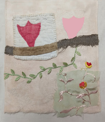
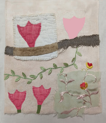
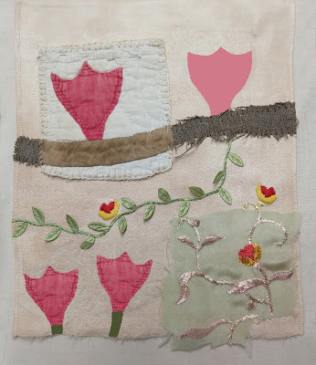
Then I thought that maybe the trouble was the right hand tulip, which took on too much weight because of its dark value. What if it were paler, to restore the focus to the original quilt tulip? And I realized that the easiest way to consider the alternatives was via photoshop.
So here are four possibilities. I put them out to you to share my thought process, not to put it up for a vote (I will happily read your comments but unfortunately the buck stops here and I'll be stuck with the final decision).
 |
| Pale tulip |
 |
| Pale tulip, two new flowers |
 |
| Pale tulip, three new flowers |
I usually audition design decisions in person, pinning and repinning on the design wall; the advantage is that a possibility can stay on display for a long time and your opinion can change over time. But doing it on photoshop certainly is quicker, and allows a side-by-side comparison with all the versions, or at least as many as you can tile onto your computer screen.
Now I have a lot more to think about. And I guess I should really photoshop some possibilities from cutting the piece in two...


No comments:
Post a Comment